With technology constantly at our fingertips, users expect a fluid experience, no matter the device they’re on (smartphones, tablets, and desktops). The key is ensuring your app adapts effortlessly to any screen, keeping users engaged and satisfied.
This guide covers the crucial steps, best practices, and trends in modern web development.
What is a Responsive Web Application?
Responsive web applications are websites that automatically adjust their layout to fit different screen sizes and orientations. This means that they look and function well on a variety of devices, from smartphones to desktops.
Step 1: Understand Responsive Design Fundamentals
Key Concepts
- Fluid Grids: A fluid grid uses relative units like percentages rather than fixed units like pixels, ensuring the layout adapts to various screen sizes
- Flexible Images and Media: Media elements such as images and videos should resize proportionally to the screen size
- Media Queries: CSS media queries allow you to apply specific styles depending on the device characteristics like width, height, and resolution
Tools & Frameworks
- CSS3 Media Queries: Core to implementing responsive design in CSS
- Flexbox and CSS Grid: These layout systems enable complex, responsive layouts with minimal code
- Next.js (with Prisma and Tailwind CSS): Ideal for building high-performance responsive applications with a modern stack that adapts easily to various screen sizes and incorporates advanced state management via React Query
Step 2: Choose the Right Frontend Framework
Choosing the right frontend framework is essential for building responsive web applications efficiently. Modern frameworks and libraries offer pre-built components that simplify responsive design implementation.
Popular Frontend Frameworks
- Bootstrap 5: Provides responsive design components, such as grids, buttons, and navigation elements
- Tailwind CSS: A utility-first framework that offers responsive classes out of the box, making it easy to adjust designs for different screens. Particularly powerful when paired with Remix or Next.js for building full-stack applications with a focus on performance and scalability
- Material UI: Built on Google’s Material Design principles, this React-based library ensures responsiveness while maintaining a modern aesthetic
Step 3: Mobile-First Design Approach
A mobile-first design strategy begins by designing for the smallest screen size and gradually expanding to larger screens. This approach ensures that the core functionality of your application is accessible on mobile devices before enhancing it for desktops.
Why Mobile-First?
- Mobile Traffic Dominance: As of 2023, mobile devices account for over 58% of global website traffic, making it essential to optimize for smaller screens
- Performance Considerations: A mobile-first approach forces developers to prioritize essential content and optimize performance for low-bandwidth conditions
Best Practices
- Minimal Navigation: Focus on simplified menus and navigation structures for mobile devices
- Scalable Typography: Use relative units like em or rem to ensure text scales well across devices
Step 4: Utilize Modern CSS for Responsiveness
Modern CSS capabilities have transformed how developers build responsive applications. Understanding and utilizing these features is essential for ensuring your web application adapts smoothly across devices.
CSS Techniques
- CSS Grid Layout: Allows for more complex, responsive layouts without the need for heavy HTML restructuring
- Flexbox: Enables flexible and adaptive layouts, especially for navigation bars, buttons, and forms
- Viewport Units: Units like vw (viewport width) and vh (viewport height) enable better control over elements relative to the viewport size
- CSS Variables: Dynamically adjust colors, spacing, and other styles to create a more adaptable design
Step 5: Implement Adaptive Images and Media
Adaptive images and media are crucial for providing a responsive experience. It’s essential to ensure that media elements load quickly and display correctly on different screen sizes without consuming excessive bandwidth. Another key performance optimization strategy is to reduce image size, as large images can significantly slow down websites.
Techniques
- srcset and sizes Attributes: Use the srcset and sizes attributes in HTML <img> tags to serve different image resolutions depending on the device
- Responsive Videos: Use aspect ratio containers or CSS to maintain the video aspect ratio while resizing it dynamically
Tools
- Image CDNs (Content Delivery Networks): Services like Cloudinary automatically optimize images based on device characteristics
Step 6: Optimize Performance for a Seamless User Experience
A responsive design must also ensure that performance is optimized across all devices. Slow load times or laggy interfaces can frustrate users and diminish the user experience.
Performance Optimization Strategies
- Lazy Loading: Defer the loading of non-critical resources, such as images or videos, until they are needed
- Minimize HTTP Requests: Combine CSS and JavaScript files and use sprites to reduce the number of HTTP requests
- Optimize Code: Minify CSS, HTML, and JavaScript to reduce file sizes and improve page load times
Step 7: Test Across Multiple Devices and Viewports
Testing your responsive web application across a wide variety of devices and screen sizes is critical to ensure a consistent user experience.
Recommended Testing Methods
- Browser Developer Tools: Use Chrome’s or Firefox’s developer tools to simulate different device screens
- Cross-Browser Testing: Ensure that your application behaves consistently across various browsers (Chrome, Safari, Firefox, Edge, etc.)
- Real Device Testing: Where possible, test on actual devices to check for any potential inconsistencies that emulators might miss
Step 8: Incorporate Progressive Web App (PWA) technologies
PWAs are web applications that provide a native app-like experience. They are responsive by nature and enhance the user experience by providing offline access, faster loading times, and push notifications.
Key Features of PWAs
- Responsive Design: PWAs are built to work across a wide range of devices
- Offline Support: Using service workers, PWAs can provide offline functionality, enhancing user experience even with intermittent internet access
- App-Like Interface: PWAs offer a full-screen, immersive user experience that mimics native applications
Step 9: Utilize Accessibility Best Practices
Responsiveness goes beyond adjusting layouts—it also involves ensuring that your application is accessible to all users, including those with disabilities.
Key Accessibility Considerations
- Keyboard Navigation: Keyboard Navigation: Make sure all interactive elements can be accessed using the keyboard
- Semantic HTML: Use appropriate HTML tags (<header>, <nav>, <main>, etc.) to help screen readers navigate your content
- Contrast Ratios: Ensure that text and background colors have sufficient contrast to be readable for all users
Step 10: Adopt a Component-Based Development Approach
Using a component-based architecture simplifies the process of building responsive applications by breaking down the UI into reusable and independently testable components.
Benefits of Component-Based Design
- Reusability: Components can be reused across different parts of the application, ensuring consistency in design and functionality
- Responsiveness at a Component Level: Each component can be designed to be responsive independently, which enhances scalability and maintenance
Popular Frameworks
Next.js, Remix, and NestJS: These frameworks promote component-based architectures while integrating seamlessly with tools like Prisma and Tailwind CSS to streamline responsive design development and boost scalability.
Step 11: Incorporate Responsive Typography
Responsive typography involves ensuring that text scales properly across various devices and resolutions, improving readability.
Techniques
- Relative Units: Use em, rem, and percentage units for font sizes to ensure that text adjusts to screen sizes
- Clamp Function: The clamp() CSS function allows for responsive font scaling by defining minimum, maximum, and ideal sizes
Step 12: Responsive Forms for Better UX
Forms are a critical component of web applications, and ensuring that they are responsive improves user interaction, especially on smaller screens.
Best Practices
- Single-Column Layout: For mobile devices, forms should typically be in a single-column layout to improve readability and usability
- Touch-Friendly Elements: Ensure that form inputs, buttons, and checkboxes are large enough to be easily clicked or tapped on touchscreens
- Real-Time Validation: Providing immediate feedback on form inputs helps users correct mistakes on the go, improving the user experience
Step 13: Use Responsive Design Testing Tools
Various tools can help you analyze and test the responsiveness of your web application.
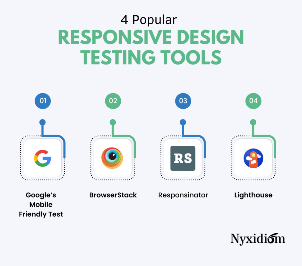
Popular Tools
- Google’s Mobile-Friendly Test: Quickly assesses whether a web application is optimized for mobile devices
- BrowserStack: A cloud-based testing platform that allows you to test on a wide range of devices and browsers
- Responsinator: Simulates how your application looks on different devices
- Lighthouse: An open-source, automated tool by Google that provides insights on performance, accessibility, and best practices, including responsive design checks for your web app
Step 14: Stay Updated with Latest Trends and Best Practices
Responsive web design trends are constantly evolving. Staying informed about the latest trends and best practices ensures that your application continues to deliver an optimal user experience.
Current Trends (2023-2024)
- Dark Mode: Increasingly popular, especially for mobile devices, where dark interfaces save battery life and reduce eye strain
- Responsive Animations: Animations that adapt to different screen sizes and input methods improve engagement without sacrificing performance
Step 15: Monitor User Behavior and Analytics
Once your responsive web application is live, it’s essential to monitor how users interact with it. Use analytics tools to track user behavior and identify areas where the user experience can be further improved.
Recommended Tools
- Google Analytics: Provides insights into user behavior, device usage, and page performance
- Hotjar: Allows you to track user sessions and view heatmaps that indicate user interaction points
Wrap-Up
Building responsive web applications for the best user experience requires attention to detail, modern web design techniques, and constant adaptation to new trends. Whether you are using Serverless with AWS Lambdas for auto-scaling backend operations, Next.js for its hybrid static and server-side rendering, or NestJS for scalable and well-structured applications, each step is crucial in ensuring that your application remains accessible, engaging, and effective across all devices.
At Nyxidiom, we craft custom web applications that fit your business perfectly. Using the latest technology and best practices, we create high-quality solutions that help your business succeed. Partner with us to turn your ideas into reality with ease and expertise.


